Inland intermodal facilities play a key role in how goods move through the freight system, but the concept is often difficult to understand due to the range of facility types and how they operate. This project breaks down that complexity through a series of visuals that explain how different facility types function, how goods move through them, and how they connect within the broader system.
Design Objective: Make inland intermodal systems understandable by visually breaking down how different facility types function and relate to one another.
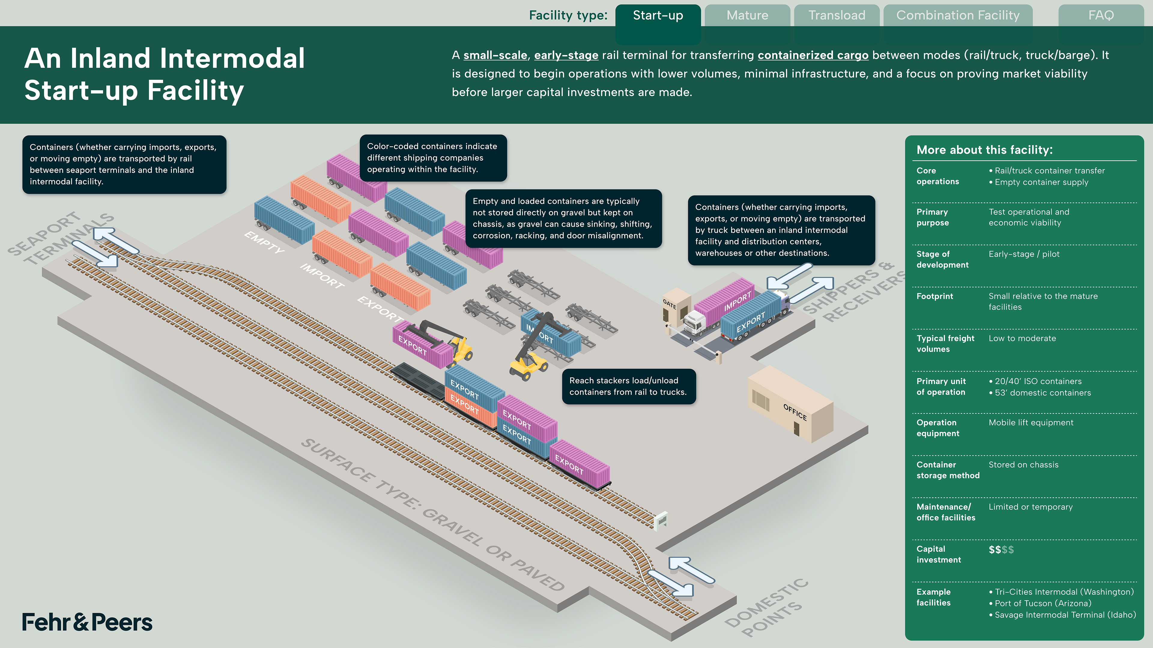
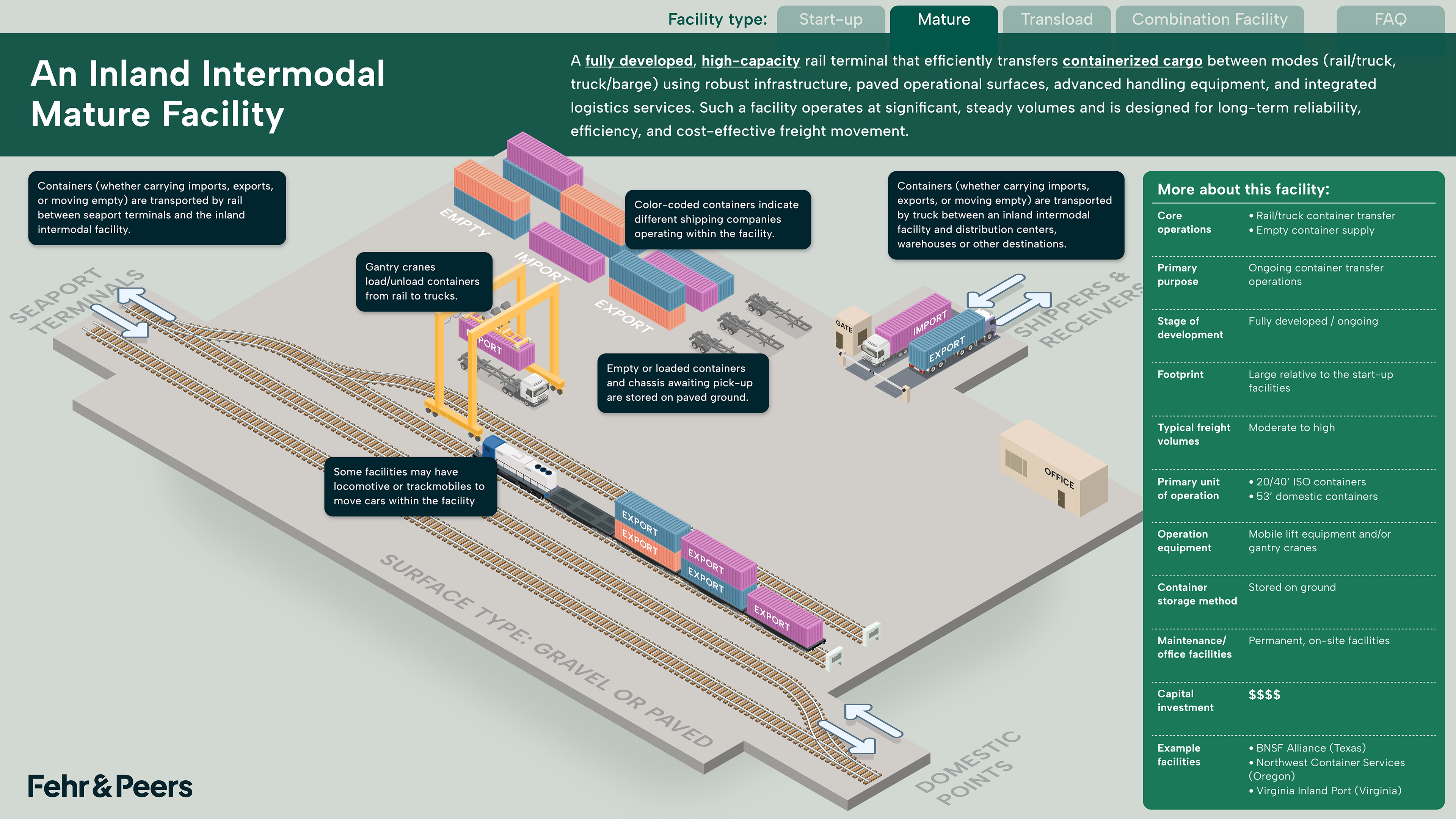
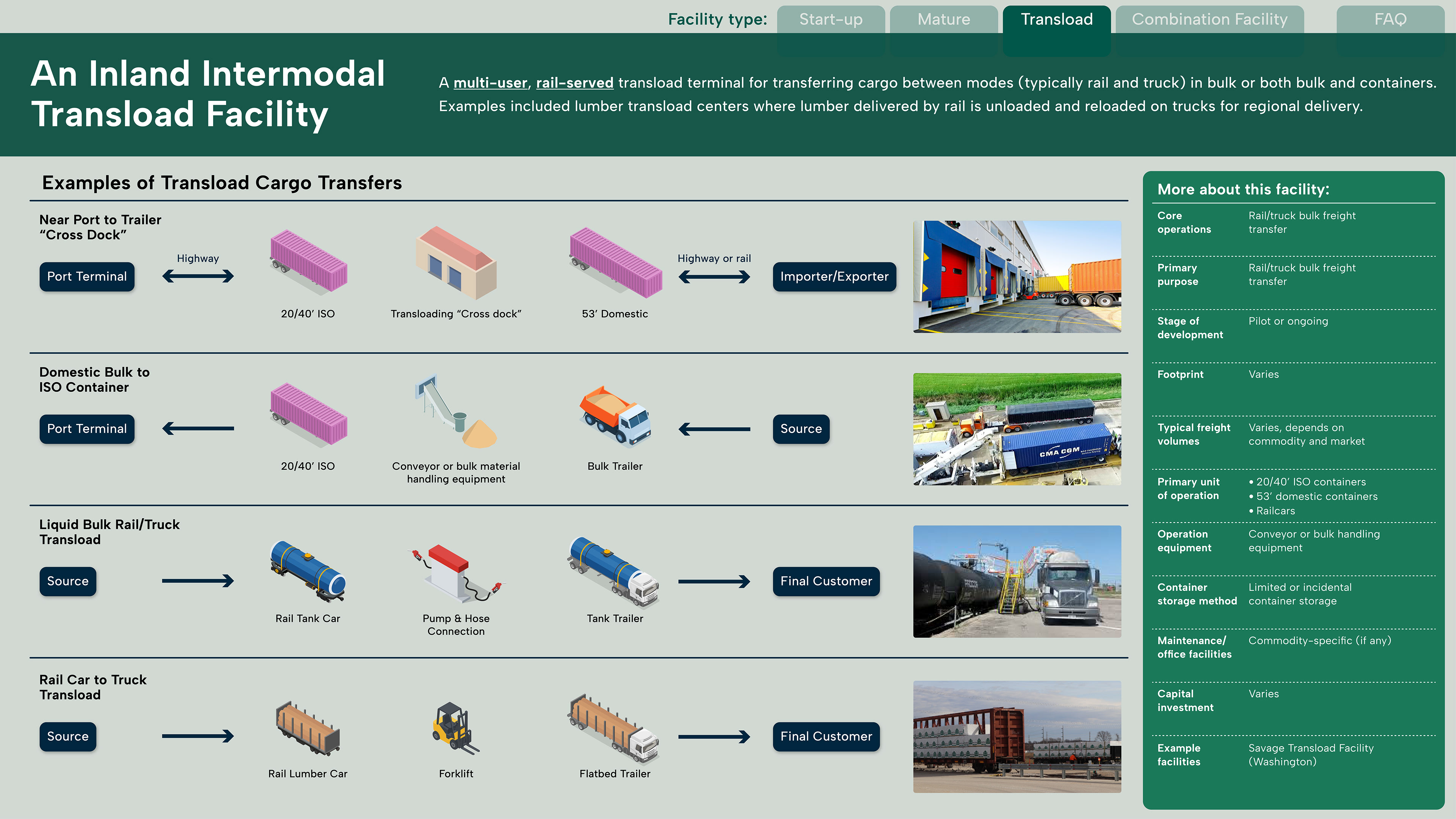
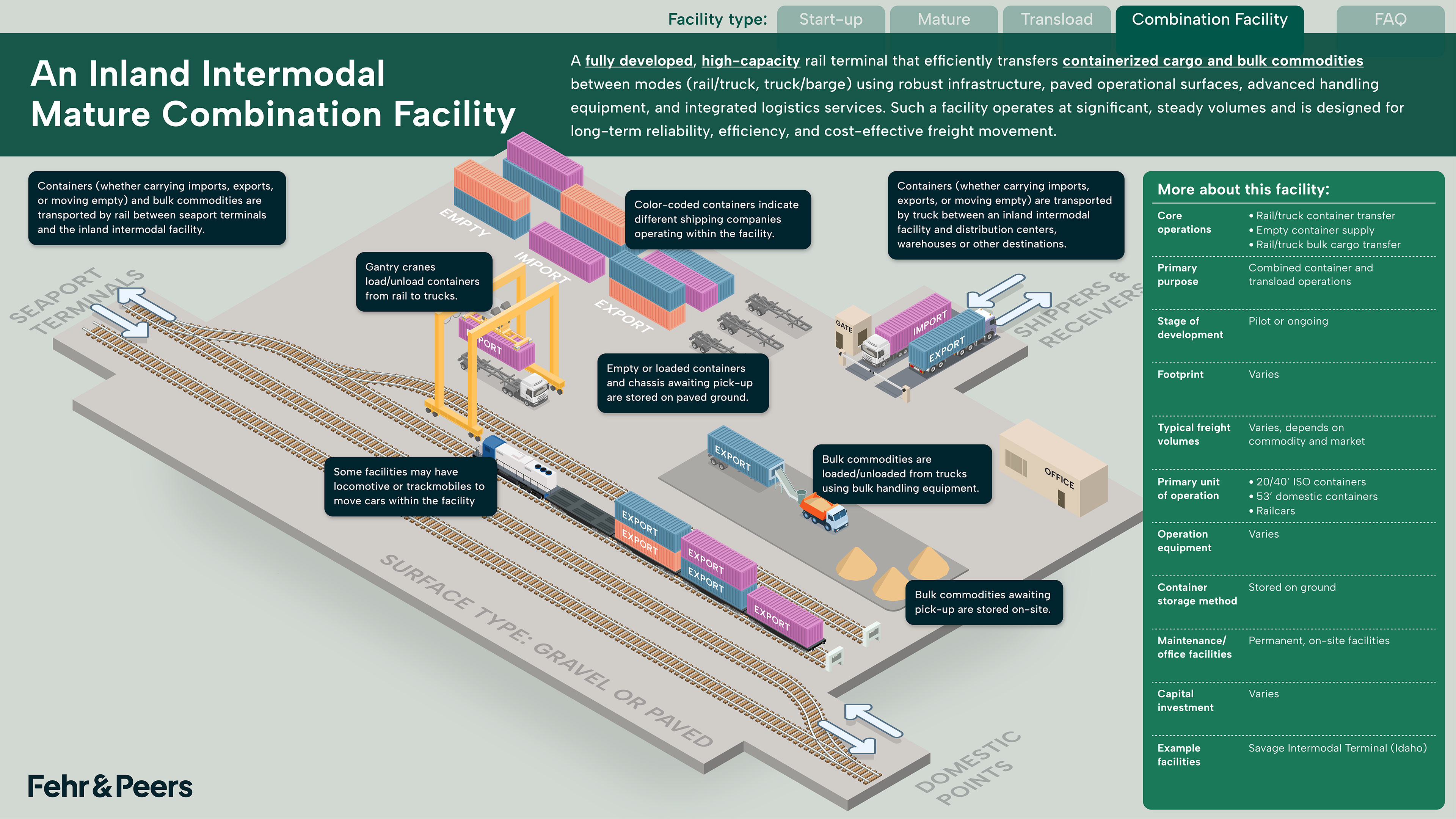
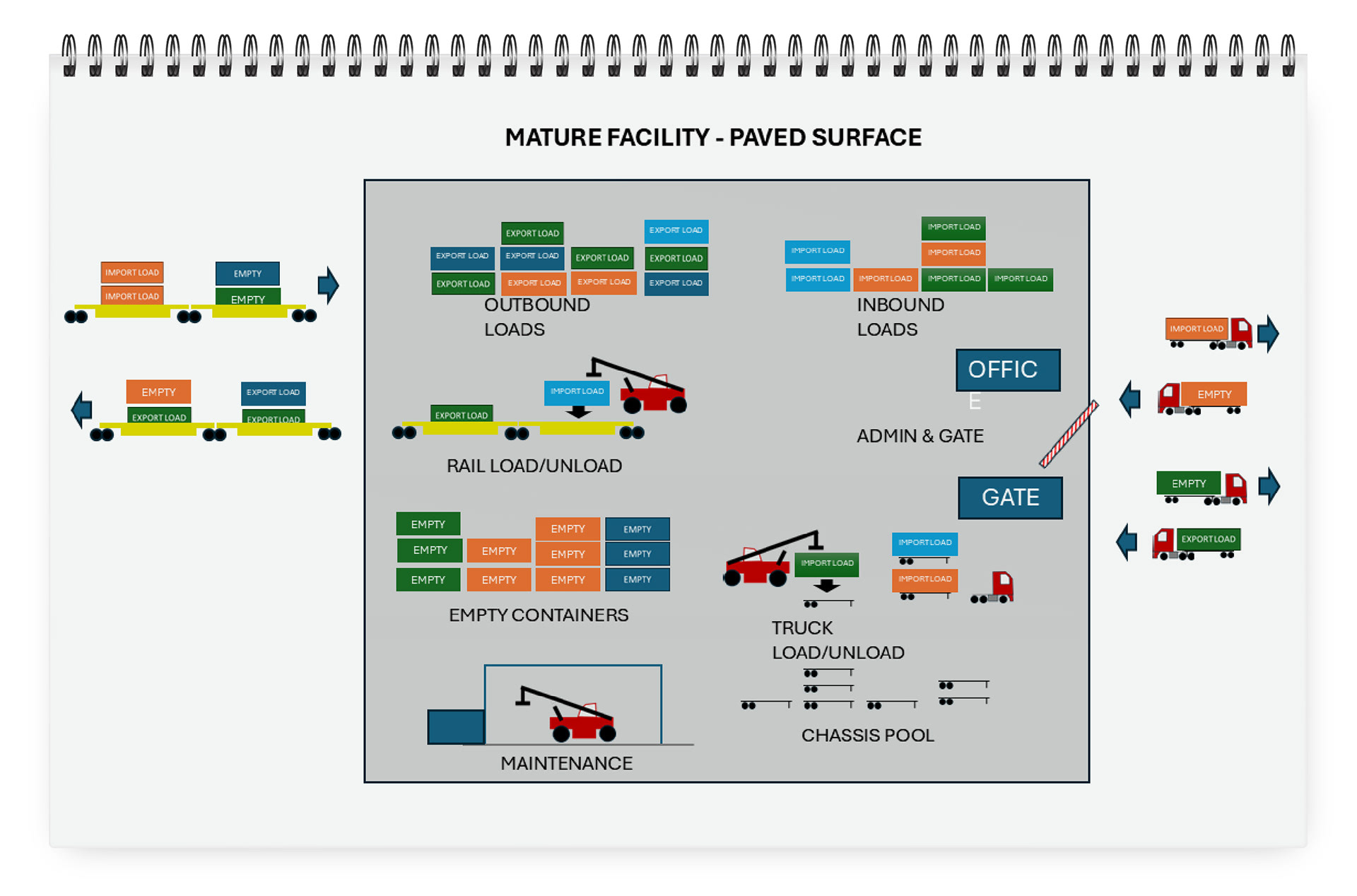
This project translates the freight ecosystem into a set of clear visual narratives that illustrate the range of inland intermodal facility types including start-up, mature, transload, and combination, and how each plays a distinct role within the system.
Each diagram maps the movement of containers and goods between rail and truck, showing how cargo flows from seaports to inland destinations and ultimately to end users. The visuals highlight key operational differences such as scale, equipment, storage methods, and level of investment, from early-stage facilities with minimal infrastructure to fully developed, high-capacity terminals designed for long-term efficiency.


The Initial Concept
It was essential to map how intermodal facilities operate, identifying key zones, flows, and relationships across the site.
At this stage, the focus was on understanding the system, not clarity. I used sketches like this one as a foundation to develop the final visual, introducing hierarchy, consistent iconography, and a clearer spatial structure to guide the reader. The result turns a dense operational layout into something intuitive, making it easier to understand how the system works as a whole.
Early concept sketch