These projects translate large-scale transportation data into clear visual narratives that support understanding and decision making. I collaborated with planners, engineers, and data scientists to develop comparative frameworks that reveal system-level patterns and impacts.
Design Objective: Communicate how relocating Amazon’s offices from South Lake Union to Downtown Bellevue reshapes the daily commute for thousands of employees.
This project translates complex datasets into a clear visual story of system-level change. Focusing on the shift from South Lake Union to Bellevue, the analysis highlights how commute patterns, accessibility, and mode choice are affected.
Transit accessibility drops significantly, with 68% of employees able to reach South Lake Union within 55 minutes by transit, compared to 28% for Bellevue. Average transit commute times increase from 35 to 50 minutes, while fewer walking and biking options further reduce viable alternatives. Together, these changes suggest an increased reliance on driving.
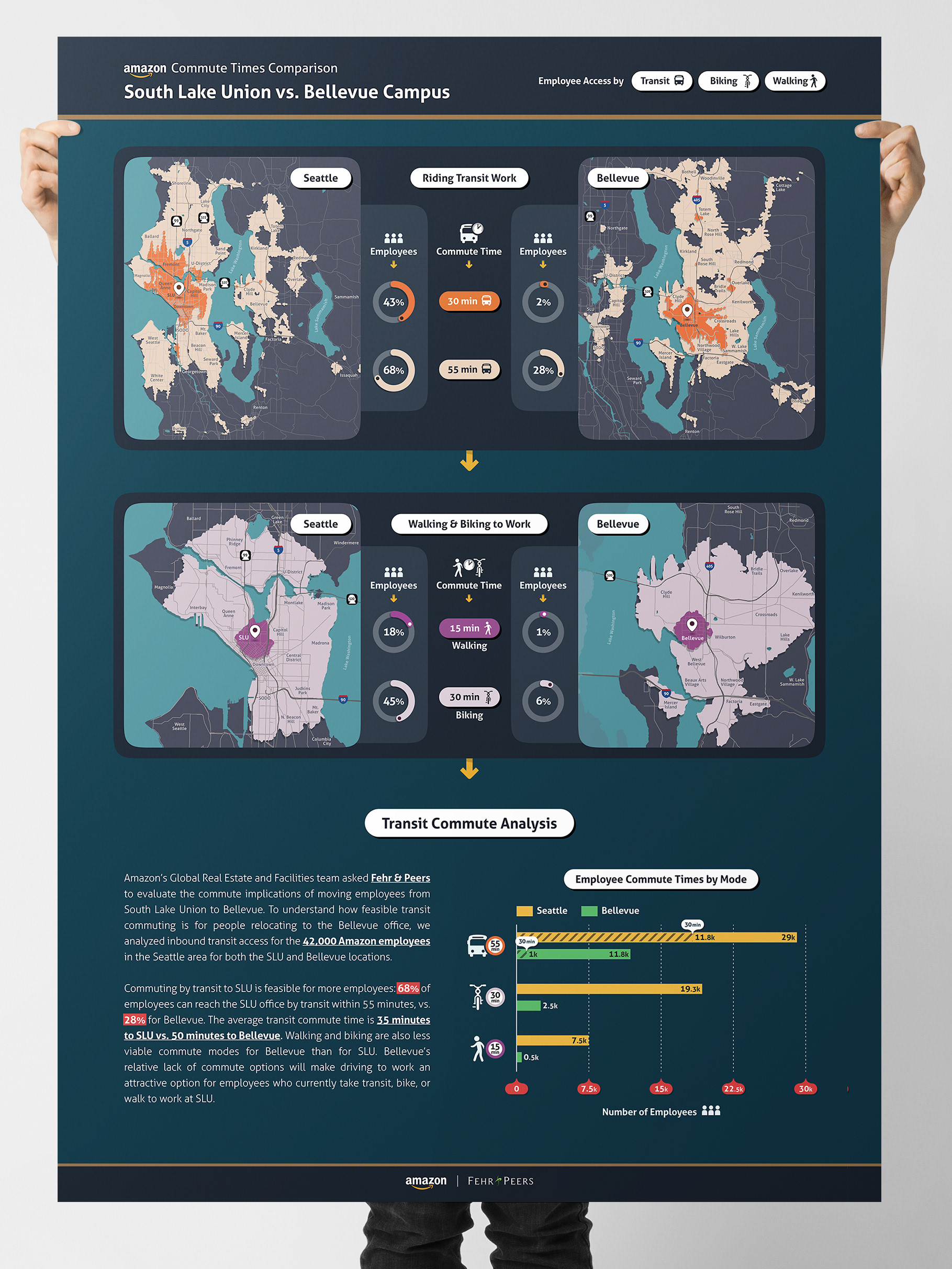
Comparing commutes between South Lake Union and Bellevue. Transit access is better to South Lake Union, while limited options in Bellevue results in a reliance on driving.
Design Objective: Communicate how holiday congestion on I-90 near Cle Elum, WA impacts traffic patterns across surrounding county roads.
This project translates time-based traffic data into a clear visual narrative that reveals how congestion extends beyond a single corridor. The infographic shows how peak summer holiday demand on I-90 drives diversion onto surrounding county roads, increasing local volumes and extending congestion into nearby communities.
By comparing speeds, volumes, and patterns over time, the visualization illustrates how pressure on one corridor ripples across the broader network.
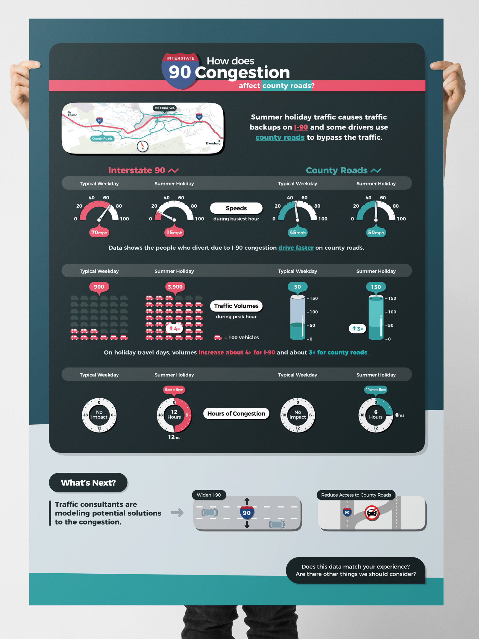
Infographic showing how holiday congestion on I-90 causes drivers to divert onto county roads, increasing local traffic volumes and extending congestion beyond the highway.